BofA Credit Card Journey, Reinvented
A UX-Driven Solution to the problematic existing journey to apply for credit cards on BofA's site.
Introduction & Basis
During my tenure at Bank of America, I had the opportunity to lead a significant project focused on revamping the consumer journey for browsing and applying for credit cards. This initiative, aimed at millions of customers across the U.S., required navigating strict compliance regulations, adhering to established brand guidelines, and meeting Bank of America's high delivery standards. Despite being a challenging project with many problems to solve, my team and I created a solution informed by rigorous research, data analysis, and thorough testing. This stands as one of my proudest achievements.This project holds special significance for me because I understand how overwhelming it can be for consumers to navigate credit card options, especially those unfamiliar with the process. Enhancing this experience not only benefits the user by simplifying their decision-making but also supports the business by fostering customer satisfaction and loyalty.Mission
- Identify usability problems and high drop-off points: Conduct thorough research to pinpoint friction points and understand reasons for drop-offs.
- Assist users in selecting the best credit card: Develop intuitive comparison tools and streamline the form-filling process.
- Ensure compliance and simplicity: Design a visually appealing and legally compliant interface.
- Optimise user journey: Implement features to guide users through the process efficiently.Goals
- Simplified user experience: Reduced drop-off rates and improved customer satisfaction.
- Enhanced features: Modernised tools for comparison and selection.
- Compliant and engaging interface: Designed a visually appealing UI while ensuring legal compliance.

Analysis & Approach: So many methods and tools available to me!
First, a little context. I joined Bank of America as a product designer, collaborating within a dedicated team comprising designers, researchers, business analysts, and developers. Our collective mission was to revamp and contemporize the credit card application journey, focusing on enhancing the user experience. Recognising the pivotal role of research and analysis in shaping user-centric solutions, I immersed myself in this process to ensure our product would resonate with users. This role proved deeply rewarding, which motivated me throughout the project. I am immensely proud of what we accomplished and the final product delivered.At Bank of America, I had the privilege of accessing a vast array of resources to conduct comprehensive and meaningful research. I approach this process with great seriousness, dividing it into two distinct phases: research and analysis.Research
In the research phase, the strength lies in numbers, and this applies to qualitative data as well. Gathering a diverse range of opinions and thoughts allows us to discern patterns and insights during the analysis phase. Our research methods included:- User Interviews: Engaging with actual users to understand their experiences, pain points, and needs.
- Usability Tests: Conducting usability tests on both competitors' platforms and our existing journey, with the privilege of being enhanced with eye-tracking.
- Surveys: Distributing surveys to a broader audience to collect quantitative data on user preferences and behaviours.
- Competitor Analysis: Analysing competitor offerings to benchmark our solutions and identify opportunities for improvement, and industry conventionsAnalysis Findings
Making sense of the often chaotic findings from the research phase is crucial. To achieve this, I organised a whiteboard workshop where designers, researchers, industry experts, and product owners collaborated. During these sessions, we brainstormed, negotiated, and prioritised the most pressing problems and potential solutions.The major issues we identified and prioritised were:- Non-Intuitive, Industry-Specific Language: Users struggled with understanding technical terms, which was described as "off-putting".
- Difficulty Comparing Credit Card Options: The current setup made it challenging for users to easily compare different credit card features and benefits.
- Overwhelming Form Design: The form users needed to fill out was perceived as lengthy and daunting.
- Overwhelming Number of Options: Users were often overwhelmed by the sheer number of credit card choices, with no clear guidance, comparison or encouragement to proceed with an application.
- Addressing these issues was pivotal in our effort to improve the user journey. By methodically breaking down and analysing our research findings, we were able to identify the core problems and devise effective, user-centric solutions.
Solution Outline: Crafted Based On Real Problems
Based on the insights gained during my research and planning stages, I crafted a detailed solution targeting the key issues identified. This solution incorporates intuitive design principles and user-focused features to significantly improve the overall user experience. In the subsequent sections, I will thoroughly explain my solution, supported by pertinent screenshots. Each screenshot will highlight a specific problem and the respective design solution, showcasing how each facet of the user experience has been carefully considered and enhanced.Card Comparison Feature
During our market research phase, we identified an emerging trend: the ability to compare credit cards side-by-side. This feature directly addressed a significant pain point highlighted during user testing of our existing system. Users frequently expressed feeling overwhelmed by the amount of information they needed to remember before checking other cards. One user even mentioned resorting to taking pictures of card descriptions on their phone to facilitate comparison.To tackle this issue, I gathered screenshots of competitors' comparison features to understand current market conventions. I also recommended conducting user testing on these competitor platforms, which proved invaluable in helping us identify ways to build a superior solution.Key User Issues Identified on Our Current Site:
- Users found it challenging to digest and mentally compare the vast amount of data points available.
- The lack of a comparison feature forced users to rely on memory or external aids, like taking photos, to compare cards.Key User Issues Identified on Competitors:
- While competitors did offer a comparison feature, it was often limited to only two items side-by-side. Despite this limitation, users preferred this option over having no comparison tool.
- The comparison feature on competitor sites was often not prominently displayed, typically accessible only via a button at the bottom of the page.Development of Our Card Comparison Feature:
Based on these insights, we set out to create a robust card comparison feature that would enhance the user experience by making it easier to evaluate multiple credit cards simultaneously. Our solution incorporated the following improvements:- Visible and Accessible Placement: Unlike competitors, we ensured that the comparison tool was prominently displayed and easily accessible on the credit card browsing page.
- Comparison of Multiple Cards: We allowed users to compare more than two cards side-by-side, addressing the limitation noted in competitor offerings.
- Intuitive Design: The comparison interface was designed to be user-friendly, with clear, concise information and visual aids to help users quickly understand the differences and similarities between cards.By implementing these features, we aimed to alleviate the cognitive load on users, streamline their decision-making process, and ultimately enhance their overall experience on our platform. The card comparison tool not only addressed a critical user need but also positioned our platform as a leader in user-centric design within the credit card market.
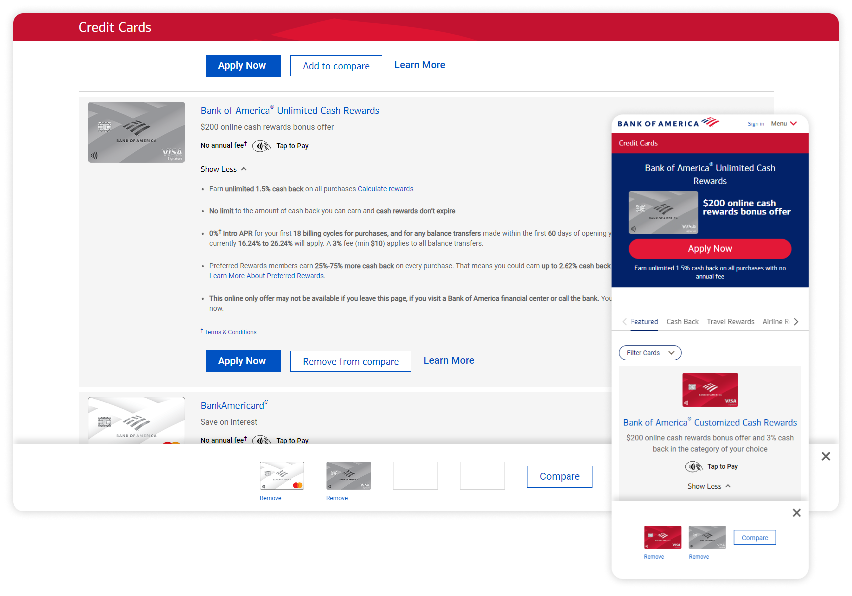
To address the issues identified in our research, my solution includes a streamlined feature allowing users to add up to four cards to a comparison list. This number is based on our data analytics, which indicated that the average user browses around four cards before making a decision or leaving the site. For mobile users, the limit is set to two cards due to visibility constraints.Seamless Integration into Card Grid:Instead of redirecting users to a separate comparison page, the comparison feature is integrated directly into the card grid. This ensures the feature is prominently displayed and easily accessible, enhancing user engagement.Sticky Tray for Added Cards:When a user selects cards to compare, a sticky tray appears at the bottom of the screen. This tray provides a clear visual of the selected cards, the number of additional cards that can be added, and options to deselect cards. This design ensures users have constant visibility and control over their selections without navigating away from the browsing page.User-Friendly Comparison Process:Once users are satisfied with their selections, they may click the "Compare" CTA to proceed to the comparison grid. This grid displays the selected cards side-by-side, allowing users to easily evaluate the differences and similarities.

We addressed key issues like overwhelming information and difficulty comparing credit cards by integrating a comparison feature directly into the card grid. Users can add up to four cards (two on mobile) to a sticky tray for easy side-by-side comparison, all without leaving the browsing page. This streamlined solution, validated through user testing and data analysis, significantly improves the credit card selection process, making it more intuitive and efficient.Consumer Findings, and Better Selling Points
Our extensive research revealed that the credit card application process is often daunting for consumers, characterized by length, complexity, and uncertainty about acceptance, especially for those with lower credit ratings. This uncertainty can deter users and increase the difficulty from a business point of view, as there is a huge number of people in the market unhappy with their credit score or financial situation.To address these challenges, we aimed to make the process more appealing and maintain a positive user experience from browsing to application completion. Our research indicated that cashback rewards and interest rates, especially when coupled with no annual fee, are the most attractive features for consumers.We emphasised these key features through improved visual hierarchy, ensuring they stand out prominently. This approach helps draw attention to the most desirable aspects while minimising the impact of less user-friendly information. By focusing on these enhancements, we aimed to reduce user frustration, increase engagement, and encourage successful credit card applications.

As shown above, once a user is on a specific credit card page, we want to them to be drawn to the benefits and rewards. I added attractive selling points, whilst moving legal details below, remaining fully legal but less intimidating. The application CTA remained stuck to the top for easy access, and drawing and keeping the user at the top of the page with all the attractive rewards, and the application CTA.To add a more immersive, personal experience, I noted an idea that I found during our market research phase, a rival bank had implemented a quick calculator to see how much cashback it translates to in dollars, not a percentage, based on their spending. For my version, I added a drop-down for the user to select a timeframe, as well as a rounded spending amount, it then instantly gives you the amount you'd be saving within that timeframe. This can be seen in my mobile screenshot above.Lastly, The Application
We have simplified our entire user journey to be as easy and attractive as possible across all platforms, culminating in the critical application step. While users may browse extensively, business success hinges on them completing and submitting the application, a step where many typically drop off. Ensuring a smooth application process is therefore crucial.This is something I decided to allocate a lot of time to. Drawing from my extensive experience in form design, I focused on implementing best practices to optimise the user experience:- In-line Validation: Providing immediate feedback to users as they fill out the form.
- Top Label Alignment: Ensuring labels are placed directly above form fields for easy readability.
- Bottom Hint Alignment: Placing hints or instructions below the relevant fields to guide users.
- Progress Indication: Showing users their progress through the application to keep them informed and motivated.
- Disclosure: Clearly explaining why certain information is needed to build trust and transparency.
- Contextually Varying Field Lengths: Adjusting field lengths based on the expected input to improve usability.
- Constraints: Applying appropriate constraints to fields to prevent errors and guide correct input.By incorporating these elements, we aimed to reduce drop-offs, enhance user satisfaction, and increase the overall success rate of credit card applications.

I worked extremely closely with the developers to get the form right, to avoid user frustration. As well as, disclosure for reassurance of security, when inputting sensitive details. I ensured our software was able to explain why and how certain data is processed.By implementing these best practices and focusing on user-centric design, we achieved a significant improvement in the application process. User feedback indicated a marked reduction in frustration, and analytics showed a higher completion rate for applications. The collaboration between UX design and development was instrumental in this success, ensuring that the form not only met technical requirements but also delivered a superior user experience.
A little conclusion, and looking forward
Embarking on this journey to enhance the credit card browsing and application experience at Bank of America has been a rewarding opportunity. I am immensely grateful for the chance to apply my skills and expertise to such a meaningful project, one that directly impacts millions of users, at such a recognisable company.Throughout this process, our focus on good research practices, clear problem-solving strategies, and effective collaboration has been pivotal. By prioritising user needs identified through extensive research, we streamlined the browsing journey and simplified the application process, ultimately delivering a more seamless and intuitive experience for users.In the spirit of continuous improvement, I recognise the importance of incorporating user feedback loops into our process for future projects. This iterative approach, coupled with improved communication and alignment between cross-functional teams, will further optimise our development process and lead to even more impactful results.This case study underscores the importance of putting the user at the centre of design decisions, leveraging robust research methodologies, fostering collaboration, and maintaining open channels of communication. By adhering to these principles, we can continue to deliver exceptional user experiences that drive business success.As we reflect on our achievements, it's important to quantify the impact of our efforts. According to our analytics, we've observed a significant increase in user engagement, with a reduction in bounce rates on the credit card browsing pages. Additionally, our application completion rates have improved, indicating a smoother and more user-friendly process.
Let's connect on LinkedIn.